Monday, December 10, 2007
Sunday, December 9, 2007
Gwinnet County Educational Center
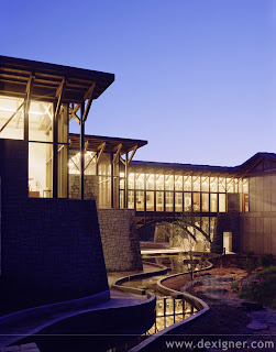
In Gwinnet county, Georgia, a new school has just opened. It teaches children in grades k-12. The teachings focus mostly on water and the importance of conserving it. The school itself is built completely with sustainable design in mind. This building is an excellent example of how sustainable design can be just as beautiful as normal buildings. People seem to think that "green" buildings aren't as well designed as a building with no restrictions. That just isn't true, nothing has to be sacrificed.
Coca-Cola

This is a vintage ad design for Coca-Cola. This ad can be looked at in two ways: from the point of view of someone reading it when it was first released or from the point of view of someone now. Seeing something as "vintage" is in itself an advertising strategy. People like to remember the past and "better days" I guess you could say, especially for the older generations. And for the younger generations it acts as a sort of portal into a world they never really knew.
Green
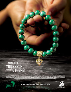
This ad is really powerful. You can tell at first glance that it is about something important, that it is for a real cause. I guess certain things send people messages when the first see them. For example: the hands in this ad say "help" and "comfort." The bracelet is very well lit and looks very beautiful which makes the consumer want the product that much more. So this ad has two things going for it, it is visually appealing and also makes consumers want to help out with the cause.
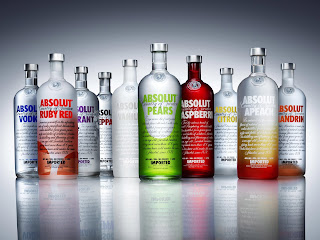
absolut
Colored Pencils

This picture was in an add for colored pencils. I really like the picture. It shows all the colors and the picture is so close up that you can see the craft of each pencil. It just makes the person who is looking at it want to draw. I think that is when you know that an add is really well designed, when the picture makes you want to use the object being advertised.
Frank Lloyd Wright
We studied Frank Lloyd Wright in my Art History class this semester and I am sorry to say that I'm not all that impressed with him. He seems to just pick one theme for all his projects and then that's it, no more compromising. We studied his Robes House. The theme for this one was horizontal line. Everything was horizontal, even the bricks were longer and more horizontal than normal bricks.
Subscribe to:
Posts (Atom)
